Advertising, Branding + Design
-

Continental Airlines
Kay Elizabeth started her career at The Richards Group in Dallas where she was the lead art director on Continental Airlines. She redesigned Continental Airlines’ brand identity as the company emerged from bankruptcy, helping gain profitability with fresh rebranding across every element of marketing. Her concepts for Continental’s advertising and flawless execution on everything from magazine and newspaper ads to billboards and posters gave Continental the “wings” to regain marketshare.
-

Ford Motor Company
Kay Elizabeth joined the newly formed “New Media Group” at J. Walter Thompson in Detroit as one of the original art directors forging new territory for Ford Motor Company in digital marketing and website design. Kay Elizabeth worked with a team to develop a “Stories” theme for the Ford Vehicles Website and was responsible for designing individual vehicle websites, along with creating digital ads for Ford on the CBS website during the 1998 Winter Olympics. Her ads were directly responsible for driving traffic to the Ford Vehicles website resulting in increased revenue.
-

Ford Credit
Ford Credit previously had various credit products, each with their own identity: "Red Carpet Lease” and “Peace of Mind”, among others. J. Walter Thompson was tasked with creating a new brand identity for Ford Credit which combined these products into a singular brand. Kay Elizabeth created the first ever branding for Ford Credit which unified these products into the Ford Credit brand. Along with developing new brand guidelines, Kay Elizabeth designed dealer kits to introduce the new branding to dealers which contained posters that could be ordered as well as a mousepad and executive introductory letter.
-

Torino Restaurant + Bar
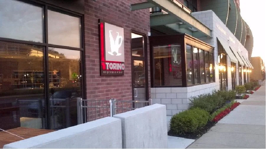
Kay Elizabeth designed a logo and branding for this new martini bar/restaurant in Ferndale, Michigan, including menus, business cards, exterior back-lit signage, and door signage. Torino was honored as the 2014 Detroit Free Press Restaurant of the Year, 2015 Hour Detroit Restaurant of the Year and One of America’s "38 Essential Restaurants" by National Eater.
-

Kundinger
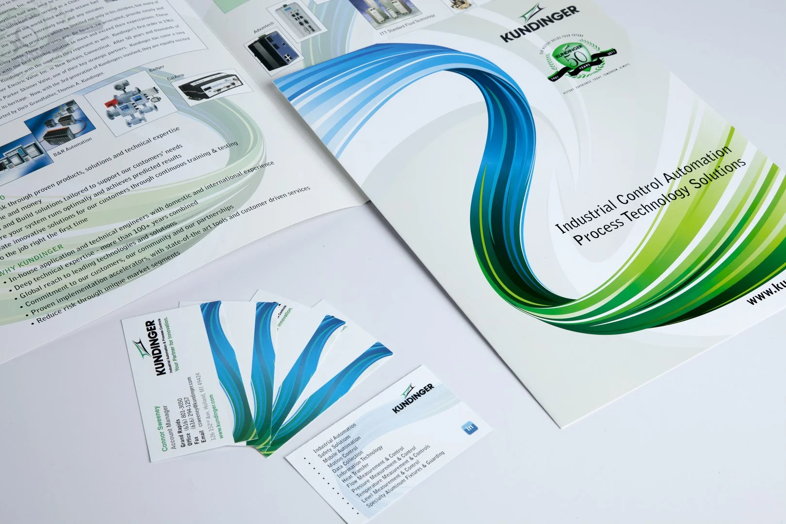
Kay Elizabeth designed everything from product sheets and brochures to invitations and emails for this industrial automation company, sourcing, estimating and handling all of the production. She was responsible for the company’s 50th anniversary event, creating and installing a historic milestone photo gallery, designing invitations, signage and communication to celebrate the company’s achievements with customers, employees, family, media and partners.
-

Clean Emission Fluids
Kay Elizabeth was asked to design a logo for Clean Emission Fluids, a a start-up business created to meet the demands of the new EPA mandate for Diesel Exhaust Fluid. CEF became a client of Kay Elizabeth’s at Brophy Marketing Services, where she conceived and oversaw the design of a logo reflecting the regenerative nature of biofuels. She also created and designed posters, presentations, business cards and signage.
-

AutoWeek
Kay Elizabeth developed the concept, design and headline for Auto Week magazine’s cover, “Night Stalker”, featuring the powerful Pontiac G8 as a stealthy animal shot at night for Brophy Marketing Services.
-

RTT
Realtime Technology AG / RTT USA Inc. needed a promotional piece to showcase their high-end 3D conceptual capabilities for the automotive industry. Kay Elizabeth designed a swatch book with laminated imagery, fastened with a hefty hinge, that was tactile, bold and sleek, reflecting RTT’s superior 3D rendering, and high-end design. Kay Elizabeth also designed branding and event materials for RTT. She acquired this client for Brophy Marketing Services.
-

Diversified Technologies International
Diversified Technologies International, a global supplier of production tooling, components and engineering services needed a brand identity as well as corporate identity materials and a website. Kay Elizabeth designed a logo that reflected their global reach, as well as corporate identity and branding materials and a website that command attention with bold black and gold. Kay Elizabeth acquired this client for Brophy Marketing Services.
-

Shelby Series One
Carroll Shelby’s Series One was designed to be a street racing car. Kay Elizabeth was asked to design the brochure to introduce and launch the Series One. Using silver metallic stock reflecting the Series One’s metallic paint, the brochure elegantly reflected this iconic brand with its signature cobra logo and clean lines. Kay Elizabeth’s role is mentioned in the account of Carroll Shelby’s storied racing history, Snake Bit, by Eric Davison.
-

Microsoft
Kay Elizabeth was commissioned to design posters for Microsoft and Microsoft MSN with a clean aesthetic, promoting product capabilities and reflecting the brands.
-

Microsoft MSN
Kay Elizabeth designed this poster for Microsoft MSN promoting website engagement.
-

Detroit Institute of Arts
As a board member of the Founders Junior Council at the DIA and its Marketing Chair, Kay Elizabeth developed and executed numerous event materials, including invitations, posters and program books for multiple years of Fash Bash®, working with Neiman Marcus and Saks Fifth Avenue to promote fashion designers including Roberto Cavalli and Carlos Miele, successfully raising acquisition funds for the FJC and the DIA.
-

City of Bloomfield Hills
Kay Elizabeth conceived, designed and produced a book to celebrate the City of Bloomfield Hills’ 75th anniversary. Using a vintage, sepia toned photograph of early century driving enthusiasts cruising up the wide open hills of Woodward Avenue, and a foil embossed logo on the cover, the entire booklet reflects the rich history of the City. Kay Elizabeth also designed an accompanying calendar with each month highlighting this historic year. The Brophy family received a "Key to the City" from Bloomfield Hills Mayor Pat Hardy in honor of this dedication.
-

Greenway Fueling
Kay Elizabeth designed a corporate identity, branding and signage for Greenway’s fueling stations which distributed variable-ration Biofuels and Diesel Exhaust Fluid. The logo reflects the company’s distribution of “clean” Diesel and Biofuels.
-

Corporate Identity Redesign : Kay Elizabeth redesigned Brophy’s Corporate Identity twice over the course of several years. This first redesign incorporated the iconic Detroit skyline.
-

Brophy
As Creative Director from 2003 - 2010, Kay Elizabeth established Brophy’s creative services, acquiring new business and generating a new revenue stream for this third-generation family business which had been solely production-based. Kay Elizabeth installed a photography studio for in-house photography of client products which could then be retouched and produced in their final form of media. From bringing in new business to conceptualizing, designing and executing everything from publications to brand identities, Elizabeth was responsible for generating new creative business, evolving Brophy’s services from production to full-service marketing. Kay Elizabeth acquired new business for Brophy: Detroit Institute of Arts, RTT USA, DTI, Clean Emission Fluids, Electrojet, Epiphany Glass and American Surgical Centers.
-
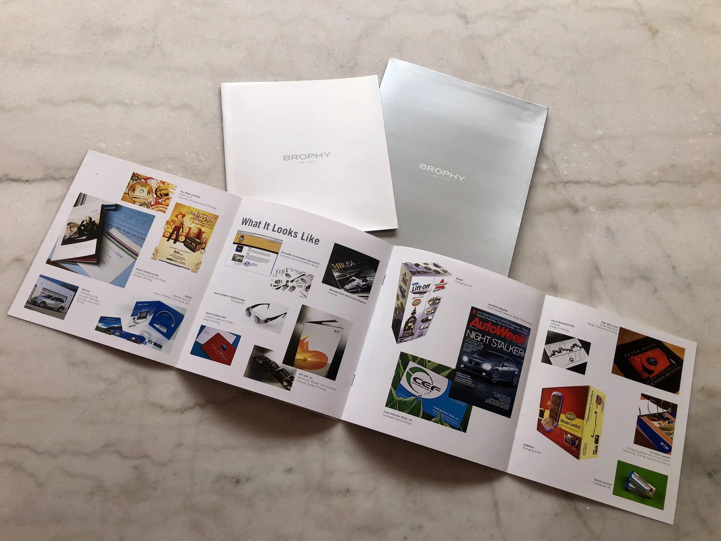
Kay Elizabeth redesigned Brophy’s Corporate Identity a second time, incorporating a clean, minimalist look for business cards, a brochure, ads, marketing materials and signage.
-
-

Detroit Institute of Ophthalmology
As a client of Brophy, Kay Elizabeth was responsible for designing and producing all of the marketing materials for the DIO’s annual Eyes On Design Car Show. Kay Elizabeth updated the EOD logo and designed everything from program books, posters, signage to tickets and website design that incorporated the featured annual automotive artist.

